

找到
1
篇与
源码分享
相关的结果
-
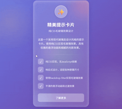
 精美的css卡片 前言 分享一个个人觉得比较美观的卡片 源码 <!DOCTYPE html> <html lang="zh-CN"> <head> <meta charset="UTF-8"> <meta name="viewport" content="width=device-width, initial-scale=1.0"> <title>毛玻璃效果提示卡片</title> <style> * { margin: 0; padding: 0; box-sizing: border-box; } body { display: flex; justify-content: center; align-items: center; min-height: 100vh; background: linear-gradient(135deg, #667eea, #764ba2); font-family: 'Segoe UI', Tahoma, Geneva, Verdana, sans-serif; padding: 20px; overflow: hidden; } .background { position: absolute; width: 100%; height: 100%; background: radial-gradient(circle at 10% 20%, rgba(255, 200, 124, 0.2) 0%, transparent 20%), radial-gradient(circle at 90% 80%, rgba(173, 216, 230, 0.2) 0%, transparent 20%), radial-gradient(circle at 50% 50%, rgba(152, 251, 152, 0.2) 0%, transparent 30%); z-index: -1; } .glass-card { width: 350px; min-height: 400px; background: rgba(255, 255, 255, 0.15); backdrop-filter: blur(12px); -webkit-backdrop-filter: blur(12px); border-radius: 24px; border: 1px solid rgba(255, 255, 255, 0.18); box-shadow: 0 8px 32px rgba(31, 38, 135, 0.2), inset 0 4px 20px rgba(255, 255, 255, 0.3); padding: 30px; position: relative; overflow: hidden; transition: transform 0.5s ease, box-shadow 0.5s ease; z-index: 1; } .glass-card:hover { transform: translateY(-10px); box-shadow: 0 12px 40px rgba(31, 38, 135, 0.3), inset 0 6px 25px rgba(255, 255, 255, 0.4); } .card-header { text-align: center; margin-bottom: 30px; position: relative; } .card-icon { width: 80px; height: 80px; background: rgba(255, 255, 255, 0.2); backdrop-filter: blur(5px); -webkit-backdrop-filter: blur(5px); border-radius: 50%; margin: 0 auto 20px; display: flex; align-items: center; justify-content: center; font-size: 40px; color: white; box-shadow: 0 4px 15px rgba(0, 0, 0, 0.1), inset 0 2px 5px rgba(255, 255, 255, 0.4); border: 1px solid rgba(255, 255, 255, 0.25); } .card-title { color: white; font-size: 28px; font-weight: 600; letter-spacing: 0.5px; margin-bottom: 8px; text-shadow: 0 2px 4px rgba(0, 0, 0, 0.1); } .card-subtitle { color: rgba(255, 255, 255, 0.85); font-size: 16px; font-weight: 400; } .card-content { color: rgba(255, 255, 255, 0.9); line-height: 1.6; font-size: 16px; margin-bottom: 30px; text-align: center; } .divider { height: 1px; background: linear-gradient(90deg, transparent, rgba(255, 255, 255, 0.4), transparent); margin: 25px 0; } .features { display: flex; flex-direction: column; gap: 15px; margin-bottom: 30px; } .feature { display: flex; align-items: center; gap: 12px; } .feature-icon { width: 36px; height: 36px; background: rgba(255, 255, 255, 0.15); backdrop-filter: blur(5px); -webkit-backdrop-filter: blur(5px); border-radius: 10px; display: flex; align-items: center; justify-content: center; font-size: 18px; color: white; flex-shrink: 0; } .feature-text { color: rgba(255, 255, 255, 0.85); font-size: 15px; } .cta-button { display: block; width: 100%; padding: 14px; background: rgba(255, 255, 255, 0.2); backdrop-filter: blur(5px); -webkit-backdrop-filter: blur(5px); border: 1px solid rgba(255, 255, 255, 0.25); border-radius: 12px; color: white; font-size: 16px; font-weight: 500; cursor: pointer; transition: all 0.3s ease; text-align: center; text-decoration: none; letter-spacing: 0.5px; } .cta-button:hover { background: rgba(255, 255, 255, 0.3); transform: translateY(-2px); box-shadow: 0 4px 15px rgba(0, 0, 0, 0.1); } .floating-elements { position: absolute; top: 0; left: 0; width: 100%; height: 100%; z-index: -1; overflow: hidden; } .float-circle { position: absolute; border-radius: 50%; filter: blur(40px); opacity: 0.4; } .circle-1 { width: 150px; height: 150px; background: #ff9a9e; top: -50px; right: -50px; } .circle-2 { width: 120px; height: 120px; background: #a6c1ee; bottom: -30px; left: -30px; } .circle-3 { width: 80px; height: 80px; background: #fbc2eb; top: 40%; left: 20%; } @media (max-width: 400px) { .glass-card { width: 100%; max-width: 350px; } } </style> </head> <body> <div class="background"></div> <div class="glass-card"> <div class="floating-elements"> <div class="float-circle circle-1"></div> <div class="float-circle circle-2"></div> <div class="float-circle circle-3"></div> </div> <div class="card-header"> <div class="card-icon">✨</div> <h1 class="card-title">精美提示卡片</h1> <p class="card-subtitle">纯CSS毛玻璃效果设计</p> </div> <div class="card-content"> 这是一个采用现代玻璃态设计风格的提示卡片。使用纯CSS实现毛玻璃效果,具有优雅的悬浮动画和细腻的光影效果。 </div> <div class="divider"></div> <div class="features"> <div class="feature"> <div class="feature-icon">✓</div> <div class="feature-text">纯CSS实现,无JavaScript依赖</div> </div> <div class="feature"> <div class="feature-icon">✓</div> <div class="feature-text">响应式设计,适配各种屏幕尺寸</div> </div> <div class="feature"> <div class="feature-icon">✓</div> <div class="feature-text">使用backdrop-filter实现毛玻璃效果</div> </div> <div class="feature"> <div class="feature-icon">✓</div> <div class="feature-text">平滑的悬浮动画和过渡效果</div> </div> </div> <a href="#" class="cta-button">了解更多</a> </div> <script> // 添加简单的悬浮动画增强效果 document.querySelector('.glass-card').addEventListener('mousemove', (e) => { const card = e.currentTarget; const rect = card.getBoundingClientRect(); const x = e.clientX - rect.left; const y = e.clientY - rect.top; const centerX = rect.width / 2; const centerY = rect.height / 2; const angleY = (x - centerX) / 8; const angleX = (centerY - y) / 8; card.style.transform = `perspective(1000px) rotateX(${angleX}deg) rotateY(${angleY}deg) translateY(-10px)`; }); document.querySelector('.glass-card').addEventListener('mouseleave', (e) => { const card = e.currentTarget; card.style.transform = 'perspective(1000px) rotateX(0) rotateY(0) translateY(-10px)'; }); </script> </body> </html>设计特点 毛玻璃效果:使用backdrop-filter: blur(12px)实现高级玻璃态效果 精致UI元素: 中心图标采用圆形毛玻璃设计 半透明边框和柔和的内发光效果 渐变分割线增强视觉层次 动态效果: 卡片悬浮时轻微上浮和阴影加深 鼠标移动时产生3D倾斜效果(通过JavaScript增强) 按钮的悬停动画 浮动元素:背景中的彩色模糊圆形增强玻璃质感 响应式设计:适配各种屏幕尺寸 这个设计完全使用纯CSS实现,仅添加了一小段JavaScript来增强交互体验(3D倾斜效果)。卡片具有优雅的玻璃材质感、柔和的光影效果和平滑的过渡动画,整体视觉效果现代而专业。 效果演示 屏幕录制 2025 06 01 031941图片